
Is Your Digital Product Accessible?
We should strive to make our websites and apps accessible for everyone, regardless of legal ramifications. It’s the moral thing to do.
Of course, we should strive to make our websites and apps accessible for everyone, regardless of legal ramifications. It’s the moral thing to do. And for years, the web accessibility movement has grown to help guide designers and developers in creating accessible products. As far as the ADA is concerned, the court system is still working through how to apply the ADA to website and online business. It does appear that over time (and more ADA suits are filed) courts are gradually applying the reach of the ADA onto online businesses. Here is a great article on where we sit currently.
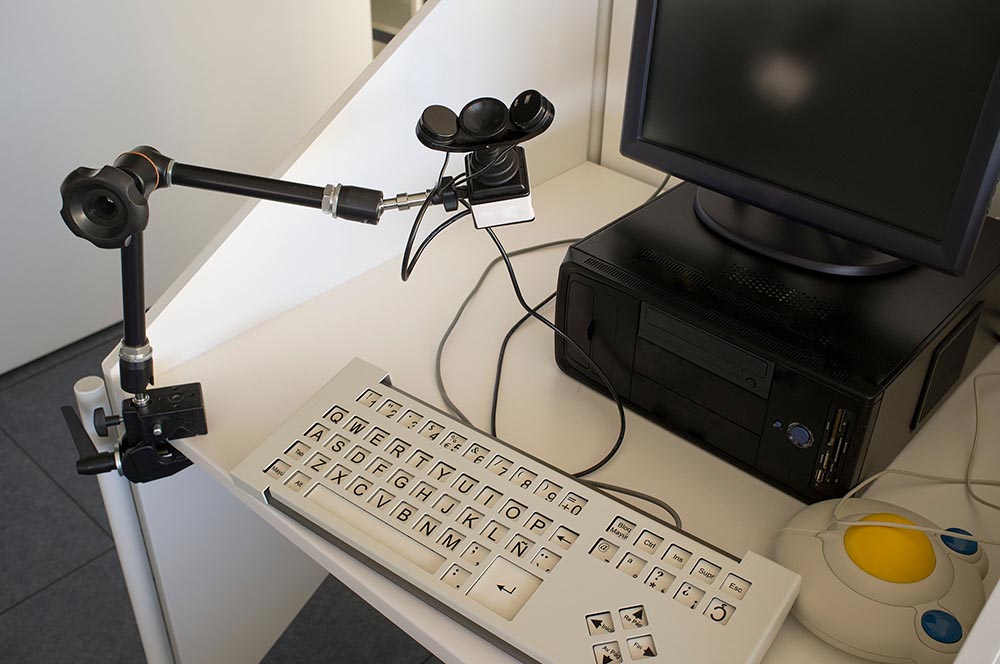
At Alliance Systems, we have worked hard to create accessibility checks at every step in our process. It’s critical and takes diligence to implement, but every digital project needs to take it into account. Even if you project in an internal business application, and you do not have any impaired internal users, it’s important to think future-forward. What if you hire a new employee who has an impairment? You’ll want your internal application to be usable by them from day one. In this blog, we’ll talk about how we address accessibility during planning, design, and development.

Planning and Discovery Includes Accessibility Too
When we start a project, we always start with a robust planning session (we call it PI Planning). PI Planning is a pillar of methodology to gather project requirements for the next 90 days. During these discovery sessions we talk in detail about the project and develop high-level features and tasks that need to happen. No design or development is done in this stage, but we do create flow charts, requirement spreadsheets, and agile-style epics and stories. Each of these types of documentation often include accessibility standards and considerations for the project.
One of the ways we do this is conducting user research. By understanding the target market and developing personas, we can determine the standards we need to set for accessibility. For example, we developed a SaaS application whose has a user type that is solely made up of baby boomers. Based on their user journey, we developed requirements that all UI feature large text with increased color contrast and large form field touchpoints. We also decided to put a larger focus on tablet usability. Aging populations use tablets in larger numbers than younger demographics. That’s because baby boomers grew up in an analog world where actual buttons and knobs completed actions. Tablets feature a larger screen for easy reading but also offers this demographic that same tactile feedback.
In addition to user stories, we focus on making sure accessibility standards are being set at design, development, and QA stages. We do this by doing building in accessibility checks as Acceptance Criteria which are listed items that need to be addressed for feature stories to be completed. This puts accessibility at the forefront of the project.
Visual Design is Critical to Accessibility
Once planning is complete, we like to move into the design stage of the project. Throughout the design process, we’re constantly checking our visuals against accessibility standards. It’s an exhaustive list and includes items such as font sizes, touchpoint sizes and spacing, color contrast, and more.
How the UI is designed has a profound impact on how users with impairments interact with your product. If the text is too small, then it can be hard to read. If a button’s text and background don’t have enough color contrast, then the item may just become a solid color block with no distinction of the text. On mobile, if your buttons are too small and spaced too close together, it can be hard for somewhat with fine-motor impairments to press the right action.
Text and Color
Here is an example of body text.

Poor Accessibility
- Body font is too small
- Body font weight is too light which doesn't read well at small sizes.
- The button features poor color constract between the text and background.
- Buttons are too small and close together which makes it hard to tap on the desired one.
Here is an example of body text.

Good Accessibility
- Body font is above 14 pt
- Body font has an approriate weight.
- The button has a readable text color against the green background.
- Buttons are large and seperate enough to make it easy to tap on mobile devices.
And these are just a few of the requirements we check against. By focusing on these requirements in the design stage, we ensure the UI is ready for the development team to tackle an accessible build.
Going Beyond the Visuals
How a digital product is coded is just as critical as how it looks. The site or app code is the backbone of how users use the site so it’s imperative that we give impaired users any advantage we can to successfully interact with the product.
Many visually impaired users use screen-readers to interact with a site. These readers parse through the source code and auditory dictation of the content. This includes navigation, images, and other visual elements. This means all elements need proper HTML accessibility tags included on all elements. For example, a screen reader can’t communicate an image unless it has a proper ALT tag that defines the visuals of the image. Going beyond ALT tags, ARIA tags can help define links, form fields, and navigation elements for screen readers.
In addition to proper tagging, a developer needs to QA their code to ensure it matches the accessible design, the responsive design works across all devices, and elements have clear focus states for users who tab instead of using a mouse or gestures.
Summary
Implementing an accessible website or application takes diligence. Many of the standards covered here may seem obvious (duh, don’t make text too small), but in practice, it can be easy to let something slide. A designer or developer may think “hey, it looks good and works for 98%” of the people who will use it. But we owe it to any impaired user to have a pleasant experience using our site or application. By creating accessible checkpoints throughout your process, you can ensure your website or application is accessible. So take action! Here are a few tools you can use to check accessibility and to learn more.
Test your site using Google's Web.Dev Tools
Alliance System's partner accessiBe provides advanced accessibility automation.
Make sure your digital products work for everyone!
Schedule Your Free Strategic Project Review & Project Brief
Developing great digital products is our passion. Not sure how to start that journey? Let us help you find the right path. Schedule a free 1-hour consultation with our team. At the end we’ll deliver a Project Brief that will help you to crystalize your vision.